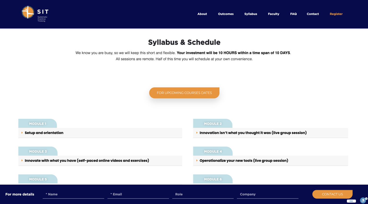
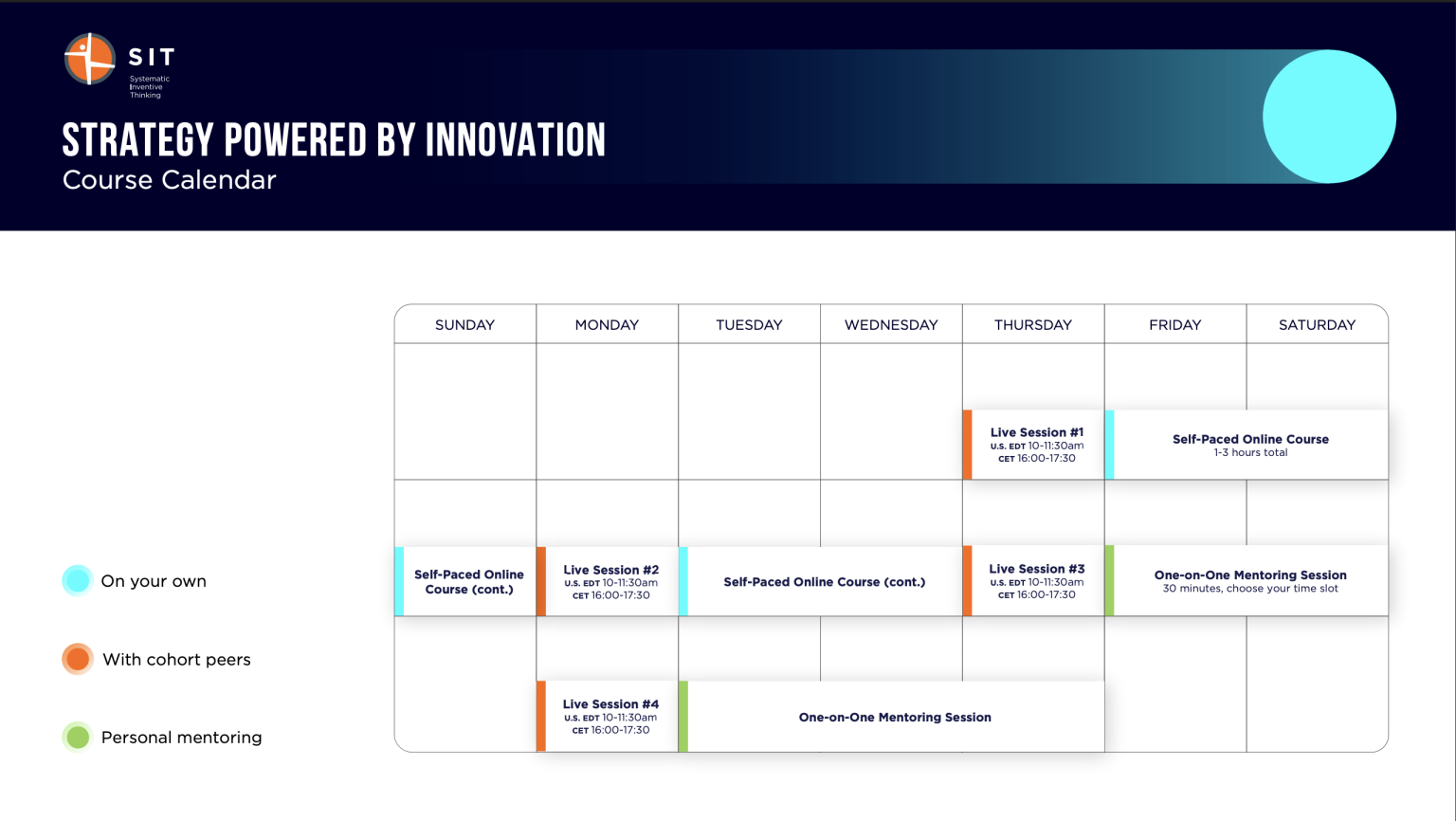
SIT’s strategy program carried real depth, but its original presentation buried that value under visual noise. I rebuilt it around a confident hierarchy — so the strategy itself, not the decoration, became the interface.
The Challenge
Visual complexity & cognitive overload
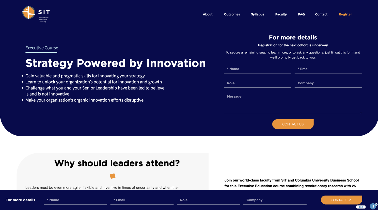
Executives met a wall of undifferentiated content with no clear entry point. Every element competed for attention, so nothing read clearly. The brief: impose a confident hierarchy and a calm reading rhythm without sacrificing the program’s substance.
The Solution
Strategic information hierarchy
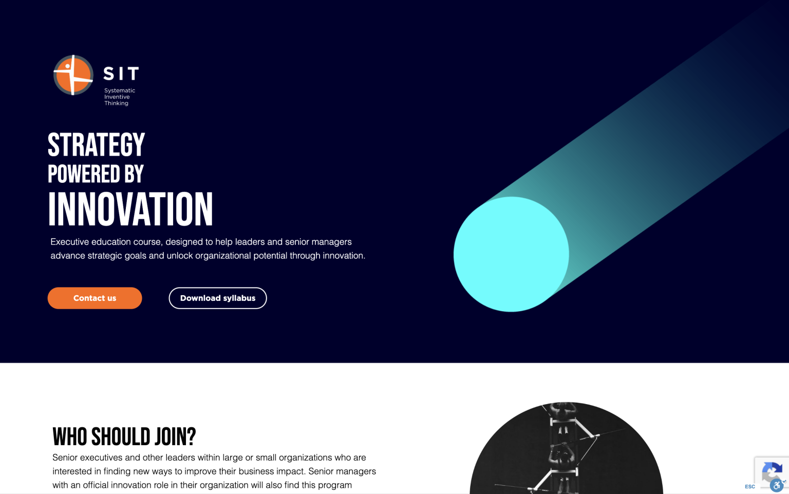
Generous spacing, a single action colour, and a layered structure guide the eye from headline to detail. Dense syllabus content was restructured into clear, scannable tiers — primary message first, supporting depth one level down, fine print last.
The Syllabus Deep-Dive
A focused reading mode lets executives drill into any of the four workshops and two learning modules without losing the surrounding context — depth on demand, never forced.
Responsive
Built for the busy executive on the move
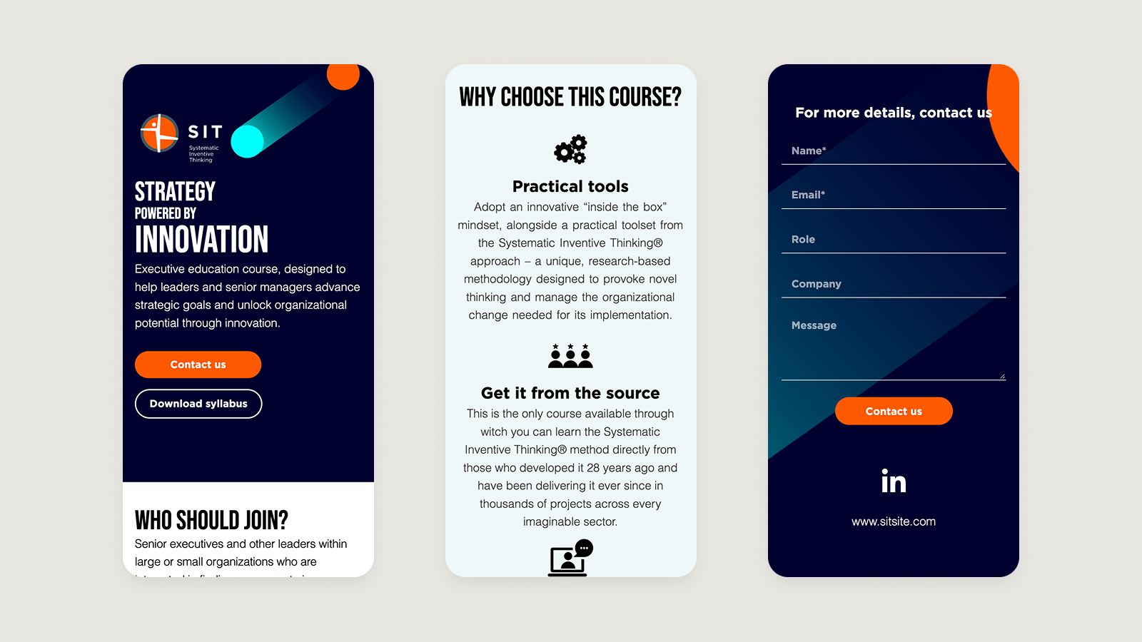
Maintaining the information hierarchy across all device touchpoints, so the experience stays consistent from boardroom desktop to the commute
Design System
Visual language & brand DNA
Functional Luxury. The palette utilizes a deep “Midnight Navy” to provide depth, punctuated by high-contrast “Action Orange” and “Cyber Turquoise” to guide the user’s eye toward key conversion points. Every element, from the modular grid to the micro-interactions of the buttons, was engineered to reflect SIT’s core values: systematic precision and inventive thinking.
01
Colour palette
#030B29
Midnight navy
#F1F8F8
Midnight navy
#03FFFF
Cyber turquoise
#FF6701
Action orange
#FFFFFF
Headings
02
Interactive elements
03
Typography system
Role
Font family
Weight
Desktop
Mobile
Line-height
Display 1
Bebas Neue
Bold
80px
38px
1.1
Heading 1
Bebas Neue
Bold
45px
28px
1.2
Heading 2
Bebas Neue
Bold
32px
24px
1.2
Body large
Roboto
Regular
18px
16px
1.6
Body medium
Roboto
Light (300)
16px
14px
1.6
Action / UI
Montserrat
Bold (700)
18px
16px
Auto
← Scroll →
Results & Impact
12
Hours
to learn how innovation demystifies strategy
28
Years
of leading global innovation programs
5000
Members
in a growing community of practice
Reflections
Constraint was the feature — the more I removed, the clearer the strategy became. A single action colour and a disciplined hierarchy did most of the work.
Credits & Tools
Design & research: me · Content: SIT · Figma, Elementor, InDesign